ShopDreamUp AI ArtDreamUp
Deviation Actions


Description


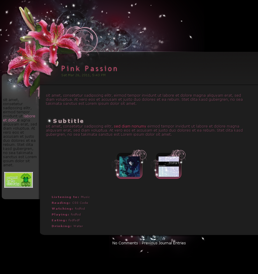
You asked for it and here it it. And even quicker than i thought that i will make it.
Didn't change that much, but imo it looks better than the older version - well it always should be the way.
Hope you like it as well!
<em>...</em>
<div class="feature">...</div>
Matching gallery skin:

Original version(gallery can't be seen in the preview):

---
Bubbles [link] by #resurgere/ =Funerium (I have permission to use his stock for journals)
Lily is personal stock
Glow brushes [link] by *redheadstock
Floral brushes by ~deviantales/~madsatsuki
(Not available for download anymore)
© 2011 - 2024 GinkgoWerkstatt
Comments141
Hello! <img src="e.deviantart.net/emoticons/w/w…" width="25" height="20" alt="
I'm a new premium member so I was looking for the perfect journal skin. What I was looking for had to be elegant, beautiful and fun to look at, but it also had to be simple. When I first saw your skin, I knew immediately that it was exactly what I was looking for. It met all of my requirements and then some! It is my new official journal skin (that I use)!
First off, is your choice of color. In addition to the pink, you also have black and some greyish-black too. You even have a little green from the leaves of the Lily. This helps a lot: instead of being drown in pink in that one area, you have a little relief due to the green leaves of the Lily. I noticed in your original version, you didn't have the leaves there. It's a good change. <img src="e.deviantart.net/emoticons/s/s…" width="15" height="15" alt="
Now for the overall look. I like the fact that the skin wasn't really all about the Lilies. For example, the little "glow dots" give it a magical feel. It also kind of draws your attention away from the Lilies for a while. Not too much, but just enough. <img src="e.deviantart.net/emoticons/s/s…" width="15" height="15" alt="
Speaking of 3- and 2-dimensional, I love the use of the floral brushes. They're right next to the Lilies and the bubbles, both very real looking. But the brushes are 2-dimensional. It gives it a nice balance between 2D and 3D. It looks so good! You know what else looks good? The brush with a different, darker shade; very close to the background. And it’s right next to the pink one! Awesome!
As much as I like this journal skin, there is one thing you could improve upon: I was trying to use the feature box and it didn't quite work out. The picture appeared in the box, but it was only the top left of it. Don't get me wrong, the feature box itself is very well done, it looks great, but it isn't fitting the deviations I want to feature. Perhaps you could make it so it could automatically fit the shape of the deviation? I don't work with code, so I don't know how hard that would be. Another thing I had trouble with: when I tried to feature multiple deviations, the boxes lined up in one column down the middle. But in your preview, they're side by side each other. I don't know if I'm screwing up or what, but that is my suggestion for something to be improved.
Well, thank you for the awesome journal skin! <img src="e.deviantart.net/emoticons/t/t…" width="15" height="15" alt="
Comments have been disabled for this deviation